A New Chapter Begins: Welcome to Our Refreshed Homepage
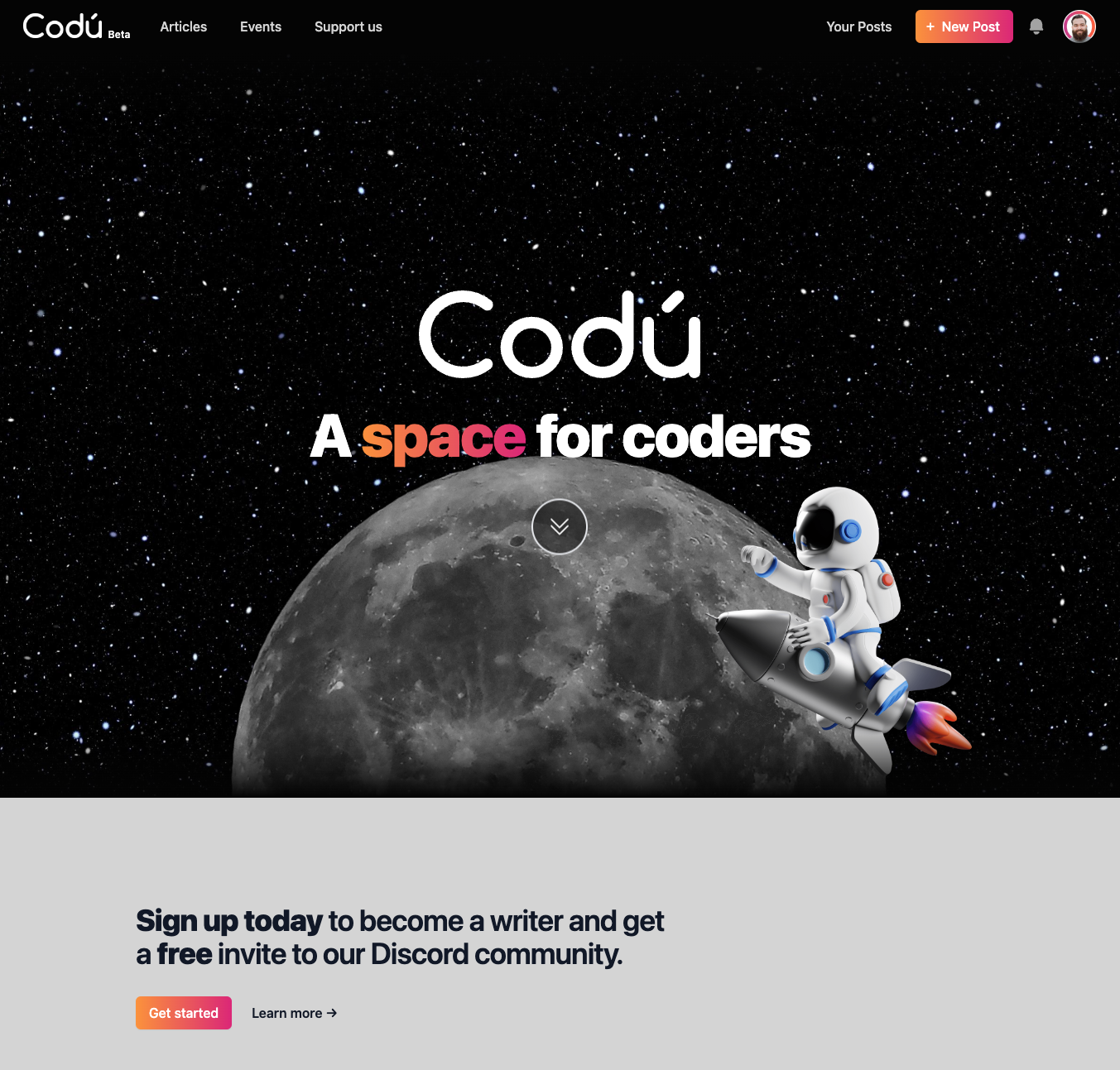
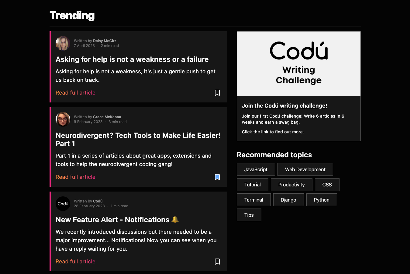
We launched a new version of the homepage to highlight the great articles being written.
We've doubled down on the "space" for coders by adopting a space theme.
We created the 3D parallax effect with Atropos, which made it easy to get the hero section to pop!
We also wanted to make it more obvious (based on feedback) that anyone can sign up and start writing.
And in case we update it, here's a screenshot of today's release.
Shiny new space theme

New "Trending" section

Like/dislike our new look?
All feedback is always appreciated.
Let us know in the comments below. 👇