List Marker - how to Style💅
^^this is a List Marker. These little visual denotations to literally mark an item, inside a list. They can be different in shape or form, like alpha-numeric characters, symbols such as discs / dashes, and even custom characters (if you so wish it to be).
And this is all great, and to most, this level of basic customisation out of the box for a list would be enough. But is it though? 🤔 For years, Developers would provide a hack in CSS to remove the List Marker, style something in it's place, and override it. It was convoluted, and a bit wild, but overtime we became over-reliant on it. Even now I still see it in use today.
List structure
<ul>List:
    <li>List item
</ul>
The HTML above is a basic List, unordered, with a single list item. But what if we wanted to customise the list marker using that hack, we would target the ::before pseudo-element of the List Item to override the marker using the content CSS property along with a bunch of other properties like display & background. As an example, let's say you wanted to customise your List Item with an image.... 👇
li::before {
    content: '';
    display: inline-block;
    height: 25px;
    width: 25px;
    background-image: url('path-to-image.png');
    background-size: contain;
    background-repeat: no-repeat;
}
But now....(and actually since 2015 I believe 😅) we can just do this instead:
li::marker {
  content: url('path-to-image.png');
}
From 7 lines of CSS...to 1. Sure, you might argue it's not really down to only 1 because you might want to re-add those size property constrants or other CSS properties for extra customisation. But still, we now have a direct selector that we can use to customise those List Markers. 👏👏👏The only caveat here is that the List Marker must have a display: list-item native to the pseudo-element itself or specified direct in our CSS.
Believe it or not, this really opens the door to continue adding value to your unique designs / branding persona on the web. The ::marker pseudo-element can even be animated in CSS. As with all pseudo-elements however, they are not natively part of the DOM and don't interact in the typical fashion that a normal Element would, hence the term pseudo, (as in....not genuine to the DOM 🙈🙊🙉).
Extending Functionality across other HTML List / Group elements
Are you a fan of Description Lists and their respective nested children....or maybe you need to use a native HTML collapse element such as the Details & Summary combo? Well no sweat, ::marker will work for those too.
Example using it with Description Lists:
Here we have a Description List with a single nested Description Term, and a sibling Description Detail:
<dl>
    <dt>Halloween:</dt>
    <dd>Is the best holiday of the year. All of the spoops!</dd>
</dl>
Now as it is highlighting the best holiday of the year. 👻🎃 We can use some emojis to add some flair to it.
dt {
    display: list-item;
}

dt::marker {
    content: '👻';
}

dd::marker {
    content: '🎃';
}
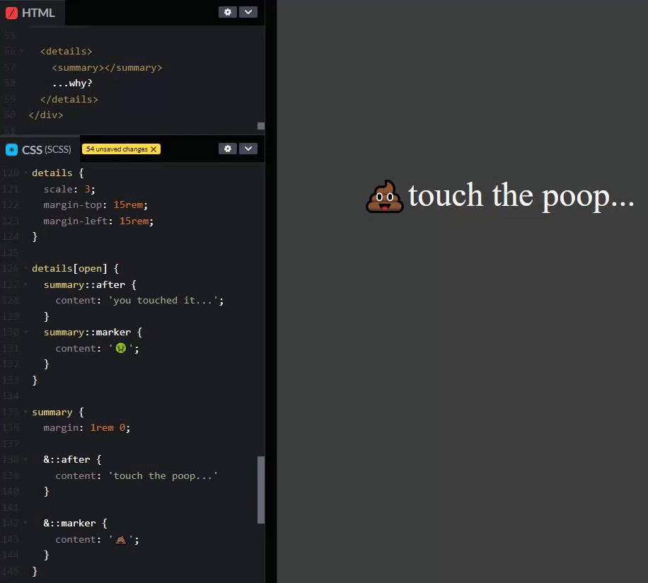
If you want to see more of this in action, I have an old Codepen with some example, and even one example that takes an SVG as the List Marker, (I have it currently commented out as the SVG is massive 🙈😅). In this codepen, I even have a Details element with a child Summary element doing some fun little things with a custom List Marker and content update depending on the open/closed state of the parent Details element, .....all being controlled in CSS. Crazy right? 🤯 Take a look:
Happy Halloween 😈😈 Spruce up your CSS with some custom List Markers. Share your own CSS tips and tricks too. 🤜
